Rebranding sounds simple until it collides with habit. People recognize logos, packaging, and names without thinking, and even small changes can feel jarring when they interrupt that routine. In these cases, companies rolled out bold new identities that confused customers, diluted brand trust, or sparked instant backlash. A few reversals happened fast, while others lingered long enough to become cautionary tales inside marketing departments.
Gap
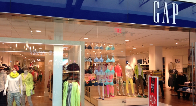
Credit: Wikimedia Commons
Gap changed its logo in 2010 without warning customers. The classic blue box was replaced by plain text and a tiny gradient square. Six days later, the old logo was back like nothing had happened. It’s perhaps because social media reacted within hours, with design jokes flooding timelines. Gap tried floating the idea of crowdsourcing a new logo, which only made things messier.
Tropicana
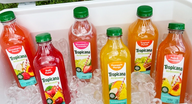
Credit: Facebook
Tropicana was easy to spot until 2009, when it dropped the familiar orange-with-a-straw for a minimalist design that blended into the shelf. Regular shoppers walked past it without realizing it was the same product. Sales fell by about 20 percent over two months, a serious blow to a grocery staple. PepsiCo rolled the packaging back and later acknowledged that the redesign made the juice harder to recognize.
Syfy Channel
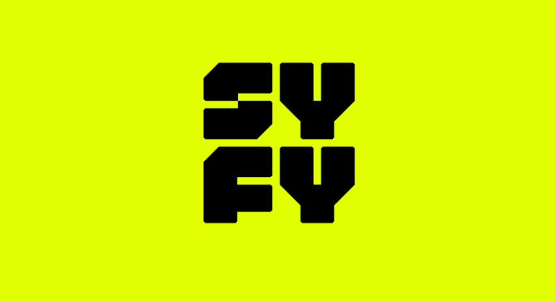
Credit: Facebook
Legal reasons led the Sci-Fi Channel to rename itself Syfy in 2009, though critics said the new name felt childish and weakened its credibility. To many fans, more than anything, the spellings looked odd. Executives simply wanted a trademark they could fully own, so the network kept the name anyway. Still, the debate pops up among longtime viewers.
Pizza Hut
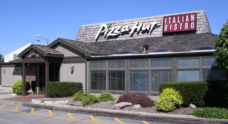
Credit: Wikimedia Commons
At one point, Pizza Hut decided its full name sounded dated. The brand experimented with calling itself “The Hut” in advertising as part of a modernization push. Customers mostly wondered why the change was necessary at all. The shorter name didn’t fix competition or food quality issues. The 2009 experiment faded quietly, and Pizza Hut went back to using its full name.
New Coke
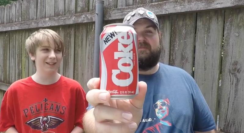
Credit: Youtube
Blind taste tests convinced Coca-Cola that a sweeter formula would appeal to people. The company replaced the original drink entirely with New Coke in 1985. Fans felt something personal had been taken away, and complaint calls poured in by the thousands. Some people even stockpiled old cans. Coca-Cola brought back the original formula as Coca-Cola Classic, which helped strengthen loyalty after the backlash subsided.
Weight Watchers
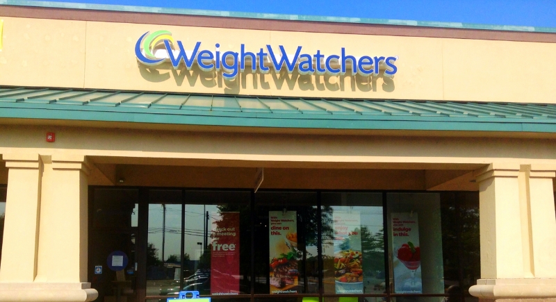
Credit: Wikimedia Commons
When Weight Watchers rebranded as WW in 2018, the goal was to shift away from dieting and toward wellness. Many customers had no idea what WW stood for at first. Decades of brand recognition disappeared almost overnight, as the company spent heavily on explaining the meaning behind the letters. Over time, Weight Watchers had to reconnect the new name to its original identity.
RadioShack
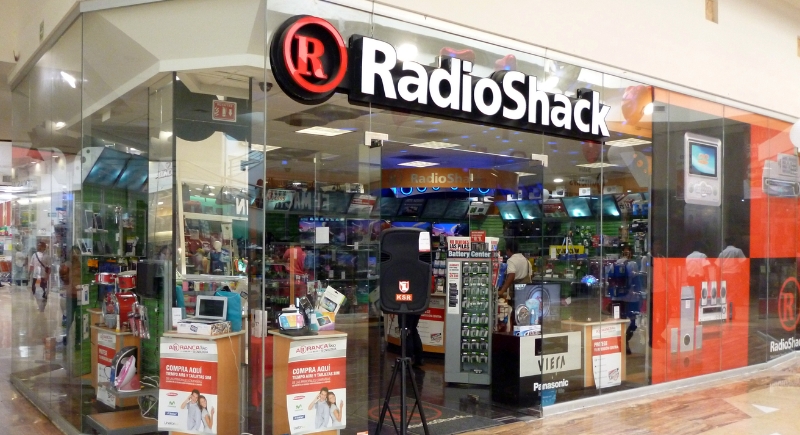
Credit: Wikimedia Commons
RadioShack leaned hard into the nickname “The Shack” in 2009, trying to sound younger. Commercials and store signs followed the new direction, but patrons found the name vague and unhelpful for an electronics retailer. The rebrand didn’t address outdated products or shrinking foot traffic. It later became a symbol of surface-level fixes during the company’s decline.
Mastercard
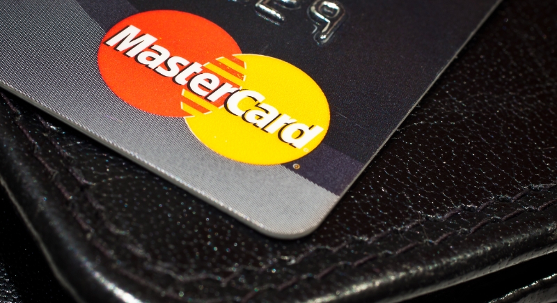
Credit: Wikimedia Commons
In 2006, Mastercard tried simplifying its logo by adding stripes and downplaying the overlapping circles. They restored familiar elements soon after, since the design reduced clarity on cards and signage. Customers struggled to identify the brand quickly, especially outside the U.S. Later updates modernized the logo without losing its core shape.
Netflix Qwikster
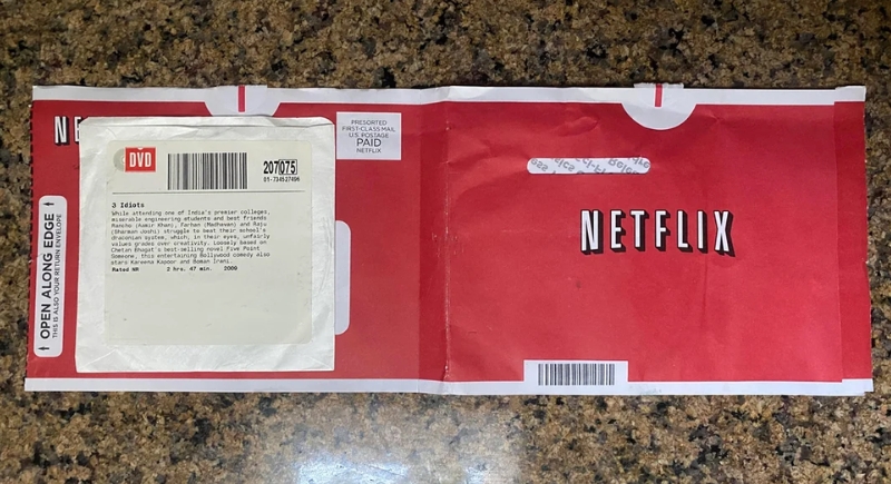
Credit: Reddit
Can you imagine calling Netflix something else? The streaming platform shocked subscribers in 2011 by announcing Qwikster as a separate brand for DVD rentals. The move followed a price hike, which already had people upset. People were even told to manage two accounts and two websites. Backlash hit instantly, and subscriber numbers dropped. Qwikster was scrapped within weeks.
British Airways
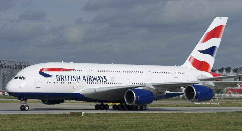
Credit: Wikimedia Commons
British Airways replaced its Union Jack tailfins in 2009 with global artwork called “World Images.” The airline wanted to appear more international, but British travelers saw it as a loss of national pride. Even the UK Prime Minister publicly criticized the change. By 2001, the classic flag design returned after sustained backlash.