Logos are often glanced at and quickly forgotten. Many of the most recognizable ones were designed with far more intention than most people realize. Apart from symbolism, designers use negative space and visual psychology to pack meaning into shapes that seem simple at first glance. These hidden details reinforce brand values and make logos stick in memory long after the first look.
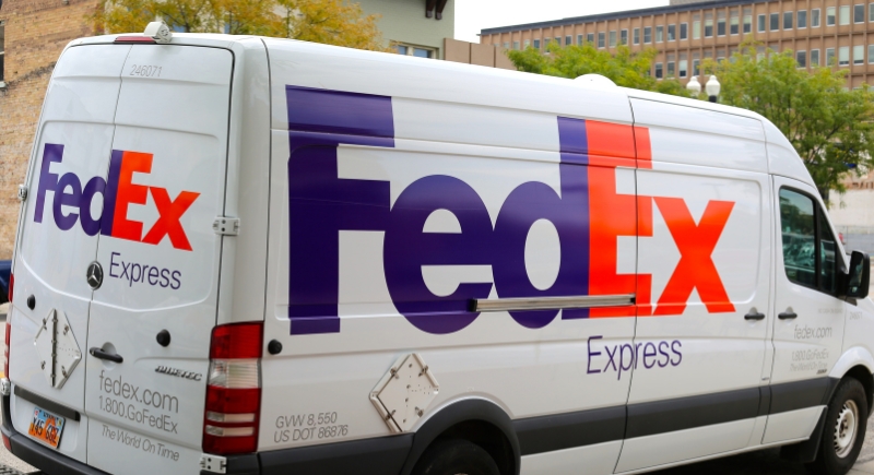
FedEx
Credit: pixabay
The FedEx logo hides an arrow between the E and the X, formed entirely by negative space. The arrow points forward to signal speed and efficiency, which are core expectations for a global shipping company. The design has survived multiple brand refreshes.
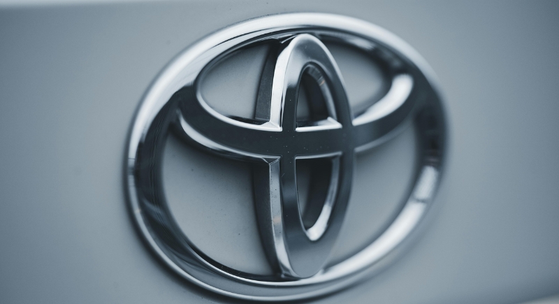
Toyota
Credit: pexels
Three overlapping ovals make up Toyota’s logo, and each shape has a job. The inner ovals represent the connection between the company and its customers, while the outer oval reflects global reach. Every letter in the word Toyota can also be traced within the shapes.
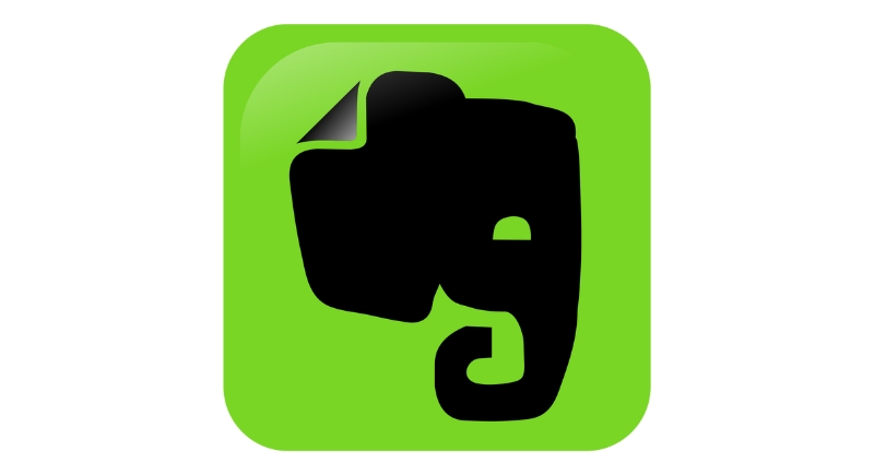
Evernote
Credit: Wikimedia Commons
Evernote uses an elephant to symbolize memory, reflecting the app’s purpose as a digital notebook. The folded corner of the elephant’s ear mirrors how people fold pages to mark important information. This small detail connects everyday habits to the digital experience the product offers.
Amazon

Credit: Wikimedia Commons
The curved arrow in Amazon’s logo stretches from A to Z, suggesting the company sells everything from start to finish. The arrow also doubles as a smile, reinforcing customer satisfaction as part of the brand promise. The bright orange color was chosen for visibility on screens and packaging across different lighting conditions.
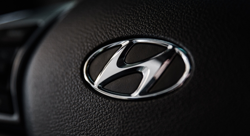
Hyundai
Credit: pexels
Hyundai’s logo is often mistaken for a stylized letter H, but it actually depicts two people shaking hands. One figure represents the company, and the other represents the customer. This handshake visual reinforces trust and partnership.
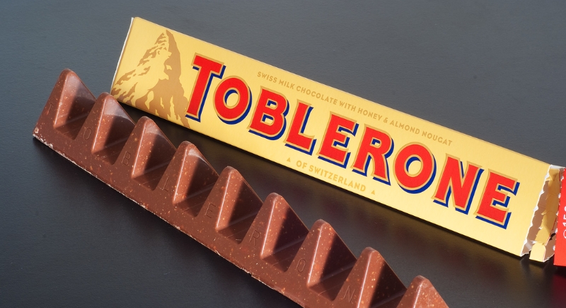
Toblerone
Credit: Wikimedia Commons
A closer look at the Toblerone logo reveals a bear hidden inside the mountain graphic. The bear references Bern, Switzerland, the city where the chocolate was created, and a place closely associated with bears. This detail ties the product to its geographic roots while keeping the packaging clean and recognizable.
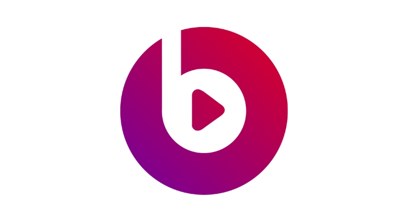
Beats
Credit: Wikimedia Commons
The Beats logo appears to be a lowercase letter b inside a circle, but the shape also resembles a head wearing headphones. The design reflects personal listening and puts the product experience front and center in the logo. The simplicity works well on hardware, apps, and packaging where clarity matters.
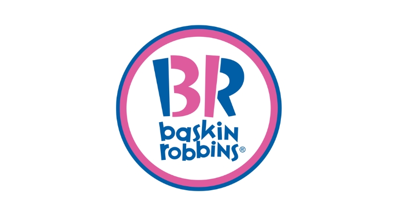
Baskin-Robbins
Credit: Wikimedia Commons
The pink areas within the letters B and R spell 31, a nod to the company’s original promise of 31 flavors. This detail reinforces variety and choice without adding extra elements. The use of pink and blue supports a playful tone while staying consistent across decades of branding.
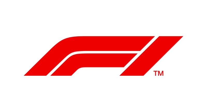
Formula 1
Credit: Wikimedia Commons
Between the F and the red speed lines in the Formula 1 logo is a hidden number 1. The red lines suggest motion and acceleration, which align with the sport’s focus on speed. The logo communicates competition and performance even when displayed at small sizes on screens or merchandise.
NBC
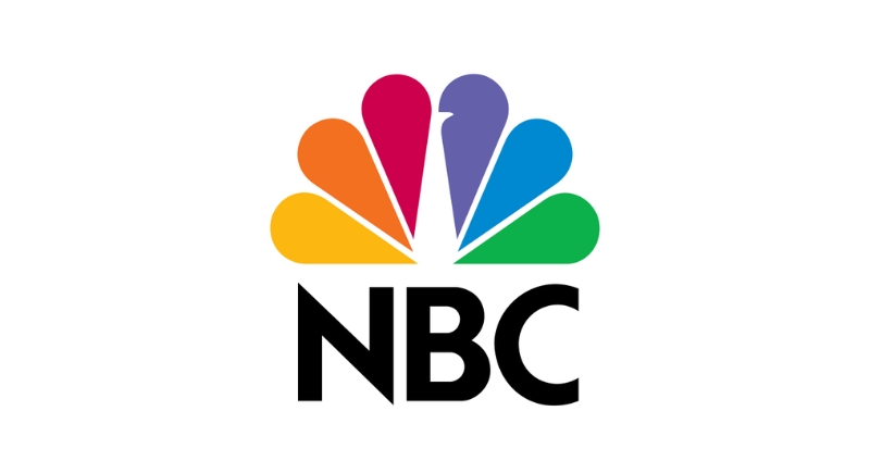
Credit: Wikimedia Commons
NBC’s peacock logo dates back to the early days of color television. The colorful feathers were used to signal that NBC broadcasts were in color, a technical advantage at the time. Each feather represents a division of the network, and the forward-facing peacock implies progress and creativity.